
OCTA Website Redesign

Redesigned with Orange County riders and communities in mind.

1. Faster access to information and rider tools

Quick Tip: On the homepage, scroll to the Rider Programs section to get the latest on special promotions and fares.
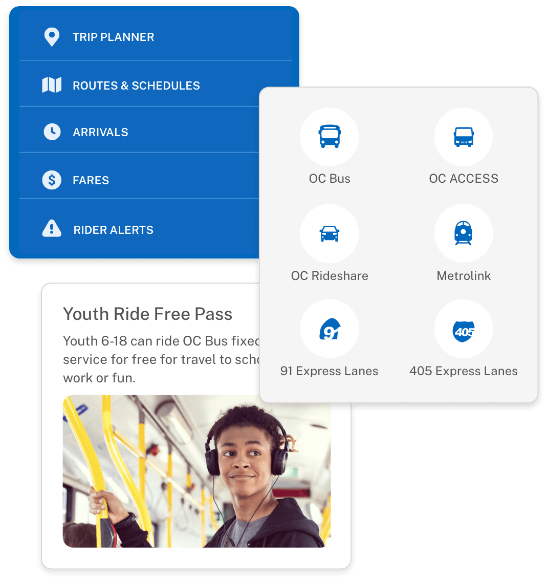
Find rider tools in one place

Our suite of powerful rider tools is now collected for easy access at the top of the homepage. Key features include the Trip Planner, Maps & Schedules, Arrivals, Fares and Rider Alerts.

Easily discover more ways to travel

Lorem ipsum dolor sit amet, consectetur adipiscing elit, sed do eiusmod tempor incididunt ut labore et dolore magna aliqua.

Stay in the know about rider programs

Lorem ipsum dolor sit amet, consectetur adipiscing elit, sed do eiusmod tempor incididunt ut labore et dolore magna aliqua.

Collage
Discover how we’re moving forward, together
Improved representation of the breadth of OCTA’s activities and responsibilities within the community that go beyond running daily transit.

2. Enhanced design and readability

Quick Tip: In most cases, you can quickly identify clickable links by looking for the OCTA blue.
Larger fonts, improved contrast

Larger font sizes assist with readability on desktop screens and smaller mobile devices. Especially on mobile, this results in an improved experience when using the OCTA website while using transit modes and being on-the-go.

Accessible colors and text

All colors have been selected to meet WCAG Grading AA color contrast guidelines. Using text on top of photography and images is avoided.

Greater page consistency

Page layouts across the website now share greater consistency. As a result, you can browse a wider variety of pages across the website and be confident in your familiarity with the interactivity and flow of information.

Before and After Before and After
Reorganized collection of programs and projects
Did you know that OCTA has over XX programs and projects ongoing? The new website makes it easier than ever to discover OCTA’s impact on freeways, streets and roads, transit and the environment.

3. Simple, streamlined navigation

Quick Tip: Look for the expandable sub-menu on mobile to find the important pages you need.
Improved page organization

As an example, the original “Getting Around” dropdown could display up to 40 pages at one time: comprehensive yet often overwhelming. The new version is simpler to scan and efficiently guides you to transit modes and rider tools.

Simplified mobile navigation

On mobile, the main navigation only goes one level deep - no more getting lost in nested sub-directories. In addition, Once you’ve navigated to a section that you’re interested in, some pages will contain an expandable sub-menu. Expanding this menu may reveal important pages to help you find the information you need.

Navigation menus Navigation menus

We appreciate hearing your feedback!

Fill out our quick feedback form and tell us what you think of the OCTA website redesign.

Tell us what you think